Bathroom color schemes do more heavy lifting than most homeowners realize. The right palette can make a cramped powder room feel airy, turn a builder-grade bath into a spa retreat, or add thousands to a home’s resale value. But walk into any big-box store’s paint aisle and the options become paralyzing, hundreds of whites alone, each claiming to be “the perfect neutral.”
This guide cuts through the noise. It covers proven color combinations that work in real bathrooms, explains how lighting and square footage affect color choices, and highlights what’s actually trending in 2026, not just what looks good on a mood board. Whether tackling a weekend refresh or a full gut renovation, the strategies below help DIYers and renovators pick schemes that deliver results.
Table of Contents
ToggleKey Takeaways
- The right bathroom color schemes can increase home resale value by up to 1.6%, translating to thousands of dollars on mid-range properties.
- Light, cool colors visually expand small bathrooms, while larger spaces over 100 square feet can handle darker, more saturated tones without feeling cramped.
- Quality bathroom-specific paint with mildew-resistant additives matters more than color choice alone for moisture resistance in high-humidity environments.
- Lighting conditions dramatically affect color perception—always test paint samples under actual bathroom lighting before purchasing, using 3000K LED bulbs for accurate color rendering.
- Bold color schemes like deep jewel tones and forest green work best in powder rooms or well-lit primary bathrooms, requiring proper sconce placement and dimmers for drama without darkness.
- 2026 bathroom color trends favor warm minimalism and earthy terracottas over cool Scandinavian palettes, balancing personality with lasting practicality.
Why Bathroom Color Schemes Matter More Than You Think
Color influences perceived temperature, room size, and even resale appeal. Bathrooms present unique challenges: high moisture levels, limited natural light in many layouts, and typically smaller square footage than other rooms. A dark navy might look stunning in a showroom but turn cave-like in a windowless half-bath.
Moisture resistance starts with paint type, but color plays a role too. Lighter hues show water spots and mildew less than dark colors, though quality satin or semi-gloss paint (specifically labeled for bathrooms) matters more than shade alone. Sherwin-Williams Duration and Benjamin Moore Aura Bath & Spa both include mildew-resistant additives.
Resale value gets a measurable boost from neutral, updated bathrooms. According to Zillow’s 2025 paint color analysis, bathrooms with light blue or soft gray walls sold for roughly 1.6% more than expected. That might sound modest, but on a $400,000 home, it’s $6,400, enough to fund the renovation twice over.
The psychological impact shouldn’t be dismissed either. Warm tones (beiges, soft terracottas) make spaces feel cozy but can amplify heat in summer. Cool tones (grays, blues, greens) create a calming effect and visually recede, making tight spaces feel larger. Homeowners who understand these trade-offs make smarter choices upfront and avoid costly repaints six months later.
Timeless Neutral Color Schemes That Never Go Out of Style
Neutrals remain the safest bet for bathrooms, especially in homes headed toward resale within five years. These schemes pair well with any fixture finish, chrome, brushed nickel, matte black, or brass, and adapt as trends shift.
Classic white-on-white still dominates: bright white trim (like Benjamin Moore Simply White or Sherwin-Williams High Reflective White) paired with slightly warmer white walls (BM White Dove, SW Alabaster). This approach works in any size bathroom and reflects maximum light. Use semi-gloss paint on trim and ceilings to resist moisture and make cleaning easier.
Greige schemes (gray-beige hybrids) offer warmth without the yellow undertones that dated 1990s beige. Pair Agreeable Gray (SW 7029) walls with crisp white trim and add texture through natural wood vanities or woven baskets. This combination photographs well, important for future listings, and pairs with virtually any tile color.
Soft gray palettes create a modern feel without going cold. Repose Gray (SW 7015) or Gray Owl (BM 2137-60) work well in bathrooms with decent natural light. Balance cooler grays with warm metal fixtures (brass or gold-toned) and wood accents to prevent a sterile look. Avoid grays with blue or purple undertones in bathrooms with fluorescent lighting, they’ll look dingy.
For monochromatic depth, layer three shades of the same neutral: lightest on walls, medium on wainscoting or lower cabinets, darkest on vanity or accent details. This adds visual interest while maintaining the flexibility neutrals provide.
Bold and Dramatic Color Combinations for Statement Bathrooms
Homeowners keeping their bathrooms long-term can take risks that create genuine personality. Bold schemes work best in powder rooms (guests see them briefly) or primary baths large enough to handle intensity without feeling claustrophobic.
Deep jewel tones are having a moment. Hague Blue (Farrow & Ball) or Naval (SW 6244) create drama when paired with brass fixtures, marble countertops, and bright white trim. These dark blues need strong lighting, add sconces flanking the mirror and overhead recessed lights on dimmers. Expect to use two coats of primer (tinted gray) under saturated colors to achieve even coverage.
Forest green and gold combinations bring richness without going gothic. Pewter Green (BM 2131-30) walls with gold-framed mirrors, warm brass hardware, and white subway tile create a sophisticated look that references both Art Deco and modern farmhouse styles. This scheme needs at least one window or excellent artificial lighting to prevent muddiness.
Black accent walls behind vanities or in shower niches add impact without overwhelming. Pair Tricorn Black (SW 6258) with white or light gray on remaining walls. Use high-gloss or semi-gloss finish on the black, it reflects light better and cleans easier than matte. This approach works in bathrooms as small as 40 square feet if the accent wall gets good light.
Terracotta and cream delivers warmth with a Mediterranean or Southwest vibe. Try Copper Mountain (BM 2153-20) on one wall, cream elsewhere, with terracotta floor tiles and natural wood elements. This palette suits bathrooms with warm undertones in existing tile or fixtures that can’t be easily replaced.
Calming Spa-Inspired Color Palettes for Relaxation
Spa palettes prioritize serenity, crucial for primary bathrooms where people start and end their day. These schemes favor cool or muted tones and natural materials.
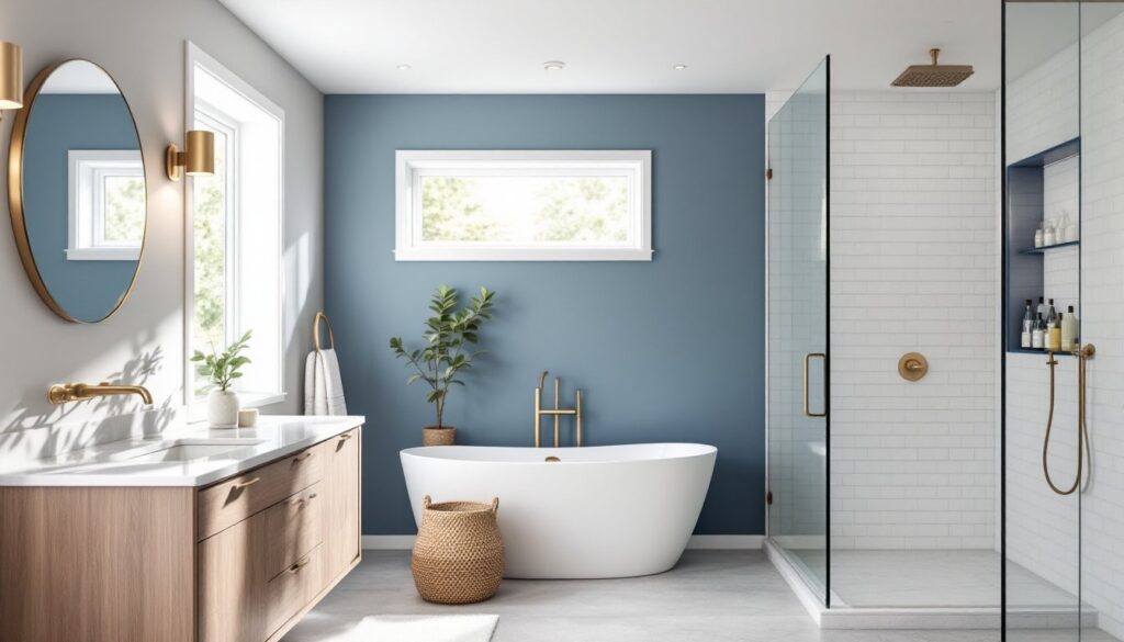
Soft blue and white remains the gold standard for spa bathrooms. Palladian Blue (BM HC-144) or Sea Salt (SW 6204) walls with white trim and marble or white tile create an airy, clean feel. These colors work especially well in bathrooms with limited natural light because they don’t go flat like grays can. Add texture through linen shower curtains, cotton rugs, and matte black or brushed nickel fixtures.
Sage green and natural wood brings the outdoors in. Clary Sage (SW 6178) or Silver Strand (SW 7057) paired with a wood-look tile floor or live-edge wood vanity creates organic calm. This scheme needs good ventilation, real wood in high-moisture areas requires either marine-grade sealer or keeping wood elements away from direct water exposure.
Soft taupe and white offers warmth without color intensity. Revere Pewter (BM HC-172) walls with bright white fixtures and natural stone tile (travertine or limestone) create a neutral spa feel. This works in bathrooms where homeowners want warmth but need flexibility for changing out accessories seasonally.
Cool gray-blue schemes like Quiet Moments (BM 1563) combine the calming effect of blue with gray’s versatility. Pair with white or light gray tile, chrome fixtures, and plenty of natural texture (woven baskets, cotton towels, eucalyptus bundles). These colors photograph slightly cooler than they appear in person, so view samples in the actual bathroom lighting before committing to a full gallon.
How to Choose the Right Color Scheme for Your Bathroom Size and Lighting
Square footage and light sources determine which colors will succeed and which will fall flat. Ignoring these factors leads to expensive do-overs.
Small bathrooms (under 50 square feet) benefit from light, cool colors that visually expand space. Stick with whites, light grays, or pale blues on walls. If adding an accent color, keep it to accessories or a single small wall, not the shower surround. Semi-gloss or satin finishes reflect more light than matte, helping small spaces feel larger.
Large bathrooms (over 100 square feet) can handle darker or more saturated colors without feeling cramped. These spaces benefit from color zoning: perhaps a darker shade in the shower area or behind the vanity, with lighter tones elsewhere. Just ensure adequate lighting in darker zones, plan for at least 75 watts of incandescent equivalent (or 15 watts LED) per 50 square feet.
Natural light changes everything. North-facing bathrooms receive cooler, indirect light that can make grays look blue and whites look stark. Compensate with warmer paint tones (those with beige or yellow undertones). South-facing bathrooms get warm, direct light that can intensify yellows and make cool colors feel balanced, ideal for blues and greens.
Artificial lighting requires testing paint samples under actual bulb conditions. LED bulbs vary wildly in color temperature: 2700K gives warm, yellowish light: 3000K is neutral: 4000K+ runs cool and bluish. Most bathrooms benefit from 3000K bulbs, which render colors accurately without the harshness of daylight LEDs. Always paint large test swatches (2′ x 2′) and view them at different times of day before buying gallons.
Windowless bathrooms need extra care. Avoid pure grays, they’ll look flat and dingy. Stick with whites or colors with warm undertones (cream, warm beige, soft gold). Maximize artificial light with multiple sources: overhead fixture, sconces, and under-cabinet lighting if there’s a vanity.
Trending Bathroom Color Schemes in 2026
Design trends shift, but understanding current preferences helps with resale value and contractor communication. These 2026 trends show staying power beyond a single season.
Warm minimalism replaces the cool Scandinavian look of the 2010s. Think Swiss Coffee (BM OC-45) or Shoji White (SW 7042) walls with warm-toned wood vanities, natural stone, and matte brass or gold fixtures. The palette stays neutral but skews warmer, no icy grays or stark whites.
Earthy terracottas and clay tones continue rising. Cavern Clay (SW 7701) as an accent wall or in tile form brings warmth without the suburban beige stigma. Pair with cream walls and natural materials. This works especially well in Southwest-style homes or renovations aiming for organic, grounded aesthetics.
Moody jewel tones in powder rooms let homeowners experiment without committing entire primary baths. Deep emerald, sapphire, or amethyst walls with brass fixtures and bold wallpaper create Instagram-worthy spaces that won’t fatigue users, guests only spend a few minutes there.
Black and white graphic schemes never fully disappear but are being executed with more warmth now: black hexagon floor tile with warm white subway tile walls, or black window frames and fixtures against off-white walls rather than stark white. This keeps the crisp contrast while avoiding the cold operating-room feel.
These trends work because they balance personality with practicality, they’re distinctive enough to feel current but rooted in materials and colors with proven longevity.
Conclusion
Choosing bathroom color schemes isn’t about chasing trends or mimicking hotel spas. It’s about understanding how color, light, and space interact in a high-moisture, high-use room. Start with the bathroom’s physical realities: square footage, lighting, and existing fixtures. Test samples on actual walls under real lighting conditions, never skip this step.
Homeowners planning to sell within five years should lean neutral with strategic pops of color in accessories. Those staying long-term can embrace bolder choices, especially in powder rooms or well-lit primary baths. Either way, quality paint formulated for bathrooms and proper surface prep matter more than the specific shade. Get those fundamentals right, and the color scheme will deliver for years.